
Create Space
Year
2021
Brand
Paintclub
Discipline
Design
Motion
Activation & Guardianship
Project Deliverables
Brand Identity
Logo Design
Art Direction
Tone of Voice
Website
Social Assets
Paintclub was founded in May 2015 as a way to make art classes a fun and social experience for the masses. Originally set up in a ‘paint and sip’ format, the sessions were hosted in cocktail bars, cafes and hotels around Ireland – working to support local businesses and create a revenue stream for local artists.
Covid-19 pushed Paintclub online, and with sessions being hosted via Facebook Live – participation exploded around the world, bringing with it a new demand for corporate events, increased accessibility and even more advanced classes.

Digital ways of working had proven to be a success, and Paintclub was ready to take the leap to an autonomous and integrated platform that could provide a better experience for students, while immersing them in the Paintclub ideology.

Through hosting a workshop with our UX and web development partner, Rawnet, we were able to better understand how the Paintclub brand itself needed to evolve in order to support the evolving digital presence of the business, while also giving it the tools needed to thrive at a global level.
Our first step in this process was to develop an updated, yet ambitious brand value proposition which is further supported by a brand DNA and architecture:
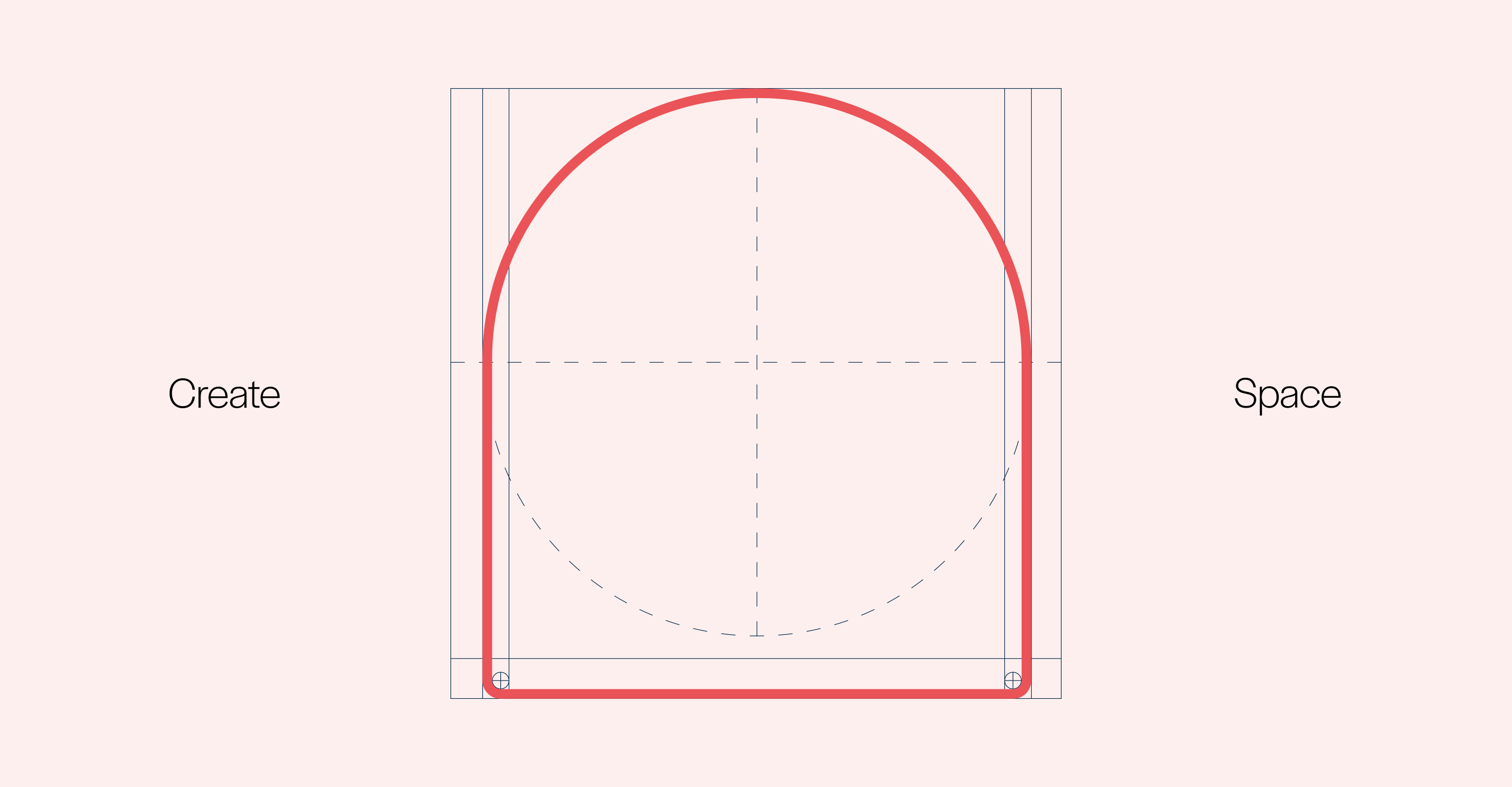
Create space – an encouragement to the world to rethink its relationship with creativity, removing barriers and making education accessible.

To bring this proposition to life we needed to evolve the Paintclub brand and bring it in line with the defined brand DNA and architecture.


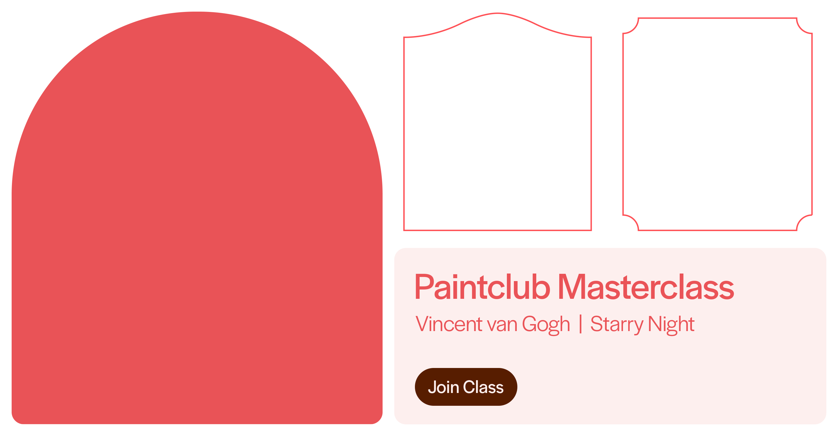
At the heart of our approach lies the design of the Paintclub logo, which was developed to strike the balance between professionalism and creativity through the use of a sans serif font and unique fluid letters.

These fluid letters became the ‘stamp’ of Paintclub approval, working as identifiable assets that would allow the application to become synonymous with the ideas of expertise and quality.
Additionally, working to align with the overarching drive and ambition of the brand we needed a way for the brand to be both scalable and unified.

This inspired a bright, vibrant colour palette and a suite of framing devices to champion the idea of a ‘space’ to create.

These paired with our graphical letter assets make for endless – yet consistent – brand application combinations.


LET’S STRIKE
A MATCH

London
Hannah McCracken
hannah@thisisfst.com
Miami
Alex Cleveland
alex@thisisfst.com
Singapore
Danica Burke
danica@thisisfst.com